Saturday, December 26, 2009

Feed Me!


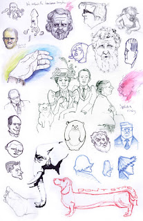
Hey folks, here's a sketch I had some fun with today. I wanted to bring in more gesture and pose emphasis than my usual stuff.

Here are a few folks I admire for their ability to capture in gesture story, character emotion, & intent right as the pen hits the paper.
http://drawger.com/stevebrodner/
http://pascalcampion.blogspot.com/
http://haraldsiepermann.blogspot.com/
http://www.peterdeseve.com/

Gorgeous isn't it! Miles to go before I sleep, and miles to go before I sleep.

I'll post some more finished work soon.

Thursday, December 17, 2009

Sketchbook-Hatching new ideas daily

I have a bunch of resolutions that respond to some great feedback from friends, and piers at CTN animation Expo. I feel like I'm setting New Year resolutions too early, but I've got no time to waste. I'm hatching a few goals here for the record.
1) Quality weekly posting on the blog
2) Daily purposeful sketching
3) Two new portfolio pieces per month (some may be client work, but I'll post what I can
4) Finish the color script for my Jumbo production my February
5) Finalize charater designs for Jumbo and share the process.

What are you working on?

Here's a sketch from my book: I love the patterns and rhythms in nature.

Wednesday, November 18, 2009

Here comes CTN-X!

I'm marching off to California this weekend for the first Creative Talent Network Expo in Burbank. It hosts some intense talent and amazing opportunities for all skill levels and interests in the animation industry.

What makes me go? I'll be introducing myself to the industry center, I want to find out where I can strengthen my skills and respond to portfolio criticisms and challenges from piers. I'm also going to meet my idols as people not bloggers.

There's a lot to be said about developing specialized skills to make the pipeline as productive as possible. I'm not sure where my skills are pointing me so I'm exploring options at CTN-X too.

Sunday, September 13, 2009

Character Design with Chris Oatley

Aloha, this week I had a blast recording a podcast episode with DTS artist Chris Oatley of Chris Oatley's Artcast. If you haven't checked out his show... shame on you, . We talked shop about continuing artistic development, networking strategies for the entertainment industry, and character development technique. I'm constantly learning from the great talents everywhere, here are some things I picked up recently. Feel free to leave your own criticisms and suggestions.

I started developing some sketches for a Sci-Fi concept. Chris took one look and sent me to a great resource The Skillfull Huntsman, the book that takes a Grimm Bros Fairytale through early concept development as if it were a real production. Here's my first sketch (1.25hrs) and some areas that instantly stood out for improvement after picking up the book.

I wanted to try some of the exercises mentioned in the book. Here are a couple of the principles The Skillfull Huntsman put forward:

Compare Apples to Apples-Using the same basic pose and create various designs varing scale, pattern, positive and negative space, etc. Here are a two of mine using one pose.
A good silhouette holds endless possibilities-After I was satisfied with the outline of a character, I try to see the different possibilities within the one form. By imagining a different place, time, gender, technology, etc. I came up with these two drastically different characters, each one has a different story & personality. What character do you see?

Did you know Luke Skywalker started out as a girl in Ralph McQuarrie's drawings and evolved into the character we know today. The initial design process is to mine the creative depths of an concept; establish a strong appropriate silhouette and build from there. Avoid jumping to the details like I did in my first drawing.

Check out these great character designers- Awesome forms. Joe Olson, Nicolas Marlet (Kungfu Panda), and Peter de Seve
More to come as I explore this world and other projects.

Thursday, July 9, 2009

Feelin' Peachy - Tutorial


Welcome to my first blog tutorial. I'll cover a little bit of my thoughts and my process for creating an ad I did with an "color editable spattering" technique for a regular client of mine. The technique is great for quickly creating variations for color keys and comps.The challenge was to create a dynamic Welcome to Atlanta Top Ten list, while using the assigned cliche of a Peach.

I'd been fascinated by late nouveau / bauhaus posters and also the Ratatouille posters uber talent Eric Tan-borrow from the best. I wanted to create a technique that would give me the textural style of the prints but have crisp vector edge treatment as well.

After settling on a sketch, I build from basic shapes to make sure the design still communicates properly.

Here are the basic non-type shapes.

A little frisket was made from a vector path that represented the inner color and leaf. Next I created the overlaying textures by spattering BLACK ink with a toothbrush onto illustration board, the frisket masking off the desired area.

A couple spatter variations were made of each shape to let me add color variation later and give me more options to choose from.

I scanned the dried ink and coverted the color mode to GRAYSCALE. (JPG, PNG, or TIFF file fortmats work fine)

In Illustrator I've placed all the pieces and can reassign and manipulate the coloring at will with the color sliders even pantone colors- (evil power hungry laugh).
Here I liked to use multiply( in the transparency window) so the colors to ineract and mix a little.

I wrote/designed the text, modifying the company's font, Geometric 315, to take on the Bauhaus style for the titles. A broad texturew as added in the background. I'm always taking pictures of random textures and scanning odd things to create an endless reference library to work with for both illustration and design.

To add the finishing touches, I used the text paths to masked some additional spatterings. The repeated textures help make sure that the texture and and crisp edged text are unified. Violla! See the completed image at the top of this post.

Please leave feedback, and I'll see what other traditional /digital tutorials I can put together. For some great tutorials on digital painting check out videos by Chris Oatley and Sam Neilson. They are both generous artists and amazing people.

Tuesday, June 16, 2009

Sketches: Factory and Feast

I couldn't help posting these sketches and offer some sage advice from today. No mind-blowing drawings, but it's part of what I did today.
My mother-in-law took the family to a buffet tonight, where I met the gentleman in the sketch.

He had an entire plate full of steak and then several other plates as well. A "Wide Mouthed Bass" shirt he wore suited him I thought; he made a great character to sketch

Advice #1
Now, I'm not Mr. Universe but I need to say, if this drawing resembles you...Put down the FORK!

The second sketch is a nearby factory I did during lunch. I did it mostly to hone my marks; there is no forgiveness with a pen and line mistakes are obvious in architecture.

Advice #2
If you want to get better, use every minute available to improve- the commute, meal time, after hours, while your file is saving,etc. No one has enough time to do everything, so make the things you do accomplish meaningful- whether that's family, work, talents, or even relaxing.

See ya' soon.

Sunday, June 7, 2009

Colored Expressions


What do you do to exercise your lighting muscles? Here's my weak attempt as promised. I am pleased to have flexed a few muscles but feel I could have tried to stretch more in regards to dynamic lighting. I used no reference for the lights.

Please let me know of any skill refining exercises you know of; continual growth, that's what life's all about.

Wednesday, June 3, 2009

Expression Sketches


I have been up late tonight working on color keys and needed something to relax. SILLY FACES! I like the hyper-extension of the features, but know I need to work on economy. I started to do color variations but started nodding, I'll try to post them before the end of the week.

Monday, May 4, 2009

Personal Project- Rough JUMBO development


Aloha friends-
For those who have wondered what's been cooking in my studio, I'll let you in a couple projects since they're not for any client. I'm posting a couple of animation backgrounds-still very rough- to keep myself motivated and to fish for feedback from my superiors PLEASE.

I'm developing a collection of backgrounds for my entertainment design portfolio with some much appreciated guidance from Lou Romano, and Glen Harmon- Thanks again guys. I hope to have 4 more backgrounds completed shortly.

These are from a story I'm developing based on the famous JUMBO elephant. I have childhood memories of the Jumbo monument in my dad's Canadian home town where Jumbo died. The historical and period research is there and I am getting into the paint.

I'm a only a few hours into these, and hoped that my fellows might steer me away from pending disasters.

I hope the backgrounds reflects the way a circus infuses a slow dusty town with life through color saturation and shape dynamics. I am also designing signage pieces for the story; here is circus paste-up banner where I tried to incorporate the shape of the elephant's trunk in the design. I've also tried to cluster the other circus characters into depending on how they relate to Jumbo-fear vs. fascination, trickery vs. apparent craft, etc.

Tuesday, April 21, 2009

IF Impossibility


If you could split your personality into various separate characters what would they look like? This impossible gathering is a triple self portrait- no not the monkey. Sometimes I take myself too seriously ( the guy in the middle) and fail enjoy life to it's fullest.

I sure wish I would have planned more for the background.

Monday, April 13, 2009

IF - Fleeting


Life is fleeting- from the nest to a final rest. This is a quick still life I'm working on to refine my digital painting techniques. I'm trying out some amazing Photoshop brushes from Chris Oatley, a generous and thorough illustrator. I'm learning as I go and there is always so much to learn! If any of you have pointers/suggestions I'd appreciate any feedback.

Enjoy

Thursday, March 19, 2009

Plein Air & Plain Feet


For those of you who thought I was dead, your almost right. I'm working like a dog these days on development for a film project, it feels great. Here are a couple images to keep my 3 three rabid fans happy.

The first is a plein air sketch (1.5 hrs) of some clouds that couldn't hold pose for very long but were great to work with. I'm trying to really flex the ole' draw-quickly-from-life muscle lately and find that my reliance on reference has left me slightly atrophied. I'll post a few of those sketches soon.

The other is one of my favorite paintings, it's part of my How Beautiful Upon the Mount series based on Isaiah's theme. I'll post up the other pieces as soon as I can shoot them.

Here our first parents have made the decision to taste the forbidden fruit and be cast out of the Garden of Eden. An uphill climb for sure after leaving his presence, but a journey possible through Christ's mediation (the light area beyond the mountains).

Hope to put some more experiments up soon.

Monday, March 2, 2009

Sampling for Kelly

Thanks to a former storyboard teacher, Kelly Loosli, who asked to see a sampling of my regular work.
I did these backgrounds for a short that Kelly was putting together a number of years back, they were created following the direction of Peter Sakievich.


Here is a random gathering of some unedited sketchbook images. As a man sketcheth so is he! I've been working on bringing in more shape based caricature to my work, so every day I fill a page with something-right now there are a lot of elephants for a story I'm working on.


The collage is a style sampler, I work in a ton of styles for various projects. Yes, that means my style has never really settled into one place, but it means I've been able to be a part of a lot of fun projects.

Most of you may not be aware, but I moonlight as designer (mostly packaging)-gasp* shock* disbelief-. Some projects I've done. I take all of my own photography.

Well that's it for this episode folks, stay tuned for more next week

Thursday, February 12, 2009

Spring Time is coming!


Spring time should be just around the corner, but today it snowed again. I can't wait for winter to give way as buds bloom and new life is everywhere.

I did this illustration based on a poem The Magic Piper by F.L. Marsh.

There piped a piper in the wood
Strange music-soft and sweet-
And all the little wild things
Came hurrying to his feet.

They sat around him on the grass,
Enchanted, unafraid,
And listened, as with shining eyes
Sweet melodies he made.

The wood grew green, and flowers sprang up,
The birds began to sing;
For the music it was magic,
And the piper’s name was - Spring!

Spring is just around the corner, wait just a bit longer and you'll see the sun for longer than the a blink of the eye.

Monday, January 19, 2009

IF: MLK others pale in comparison


I couldn't help but post this drawing today as the U.S.A. celebrates the life of Rev. Martin Luther King Jr. a brave peace fighter for human rights. He was murdered for teaching that people of all backgrounds, colors, beliefs, etc should live in equality with freedom from fear and the right to pursue greatness without limits. It's hard for me to teach my kids just how wonderful Rev King's life and teachings really are.

Every year we watch his "I have a dream speech", if you have a moment please watch it.

The drawing was done years ago and is full of errors I would like to correct, but I felt it was important to post it.

God bless us all to be more loving and accepting our differences.

Saturday, January 3, 2009

IF: Resolve to Draw Better


There is no skill more valuable than the ability to draw well (personal definition: effectively render what you see); my subjects may change & my style may evolve, but my ability to draw well can only be enhanced as I practice, critique and refine my work.

I started the new year by deciding to draw this portrait for some dear friends of mine. It's of the family's son who's in Brasil for two years. Doing "Thank you" drawings is a way that I'm forcing myself to do observational drawings more. No matter what your resolution, back it up with some immediate action plan...and just do it.

Thanks and Tchao

PS I just love using the chipboard, that is supposed to be junked, as a halftone drawing surface. The little black and white charcoal get a lot of help from the chipboard.


Subscribe to our Newsletter

Contact our Support

Email us: Support@templateism.com

Our Team Memebers